Commissioned Data-driven PR Research
Since 2013, following the viral spread of Deep Inside, I’ve produced dozens of data-driven PR projects for corporate clients ranging from startups to FTSE/Fortune 500 companies.
Here are some of the corporate projects I’m proudest of.
Splashback: Revealing the Hidden Mess Created by Peeing While Standing

How do you propel a local bathroom supply store into news headlines around the world?
You choose a topic that relates to what they sell just enough to explain why they’d commission original research into it. In this case: toilets. Then you explore the topic in a surprising, highly visual, and somewhat disgusting way.
The concept I came up with was to reveal how far and wide urine splashes when men pee standing up instead of sitting down. And, as a bonus, determine which aiming technique results in the least mess.
I created a ‘urethral analogue’ to simulate standing urination that matched the external orifice diameter, flow rate, total volume, and spiralled stream shape of the real thing. Then used UV lights and fluorescent liquid to track the splashes.
Over the course of 10 days, I flushed and reset the testing toilet over 200 times, capturing every splash in glorious high-definition. I then compiled the footage into a five-minute video that accompanied the full write-up of the results.
To supplement the experiment, I ran a survey of 680 American and British men.
Original findings included:
- When at home, seven in 10 men said they usually pee standing rather than sitting.
- In every simulation, peeing while standing covered the toilet and surrounding area with splashback that usually remains unseen.
- The furthest distance a droplet flew during our tests was 36 inches – nearly one metre. One in four people surveyed said their toothbrush was within this distance.
- Faced with the reality of splashback their standing urination creates, one-quarter of men would consider sitting down more often in the future.
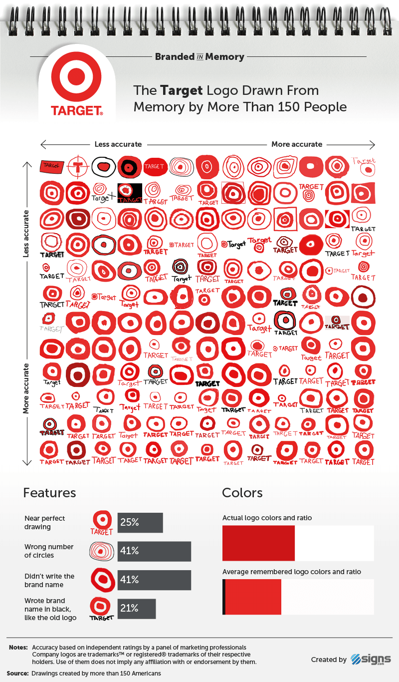
Branded in Memory: Testing Our Ability to Remember Famous Logos

Which side of the Apple logo has the bite? Does the Burger King logo feature a crown? How many dots are on the Domino’s logo?
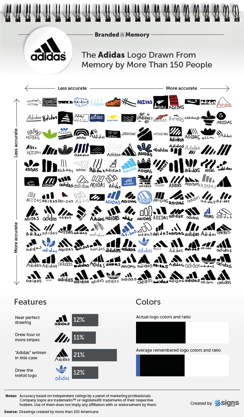
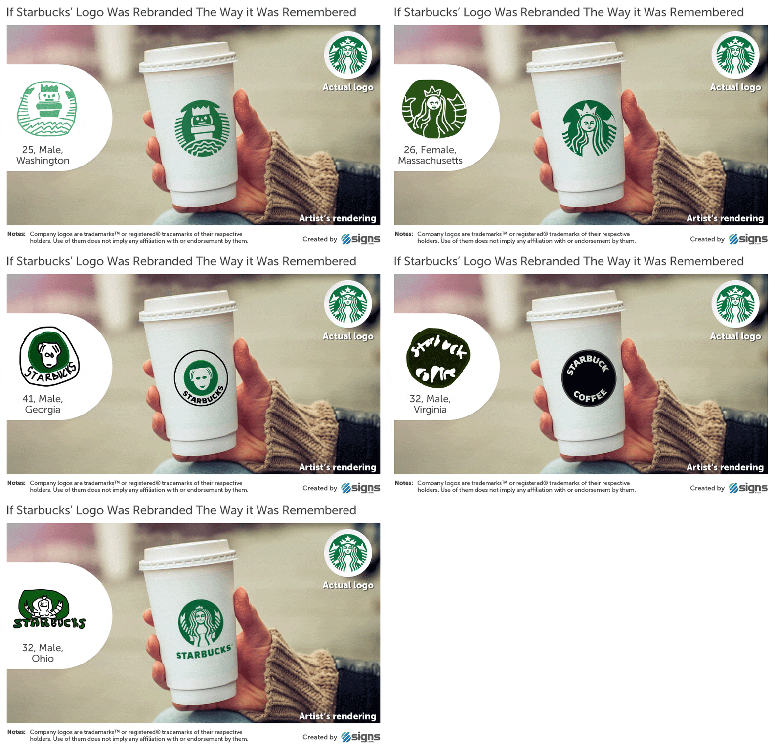
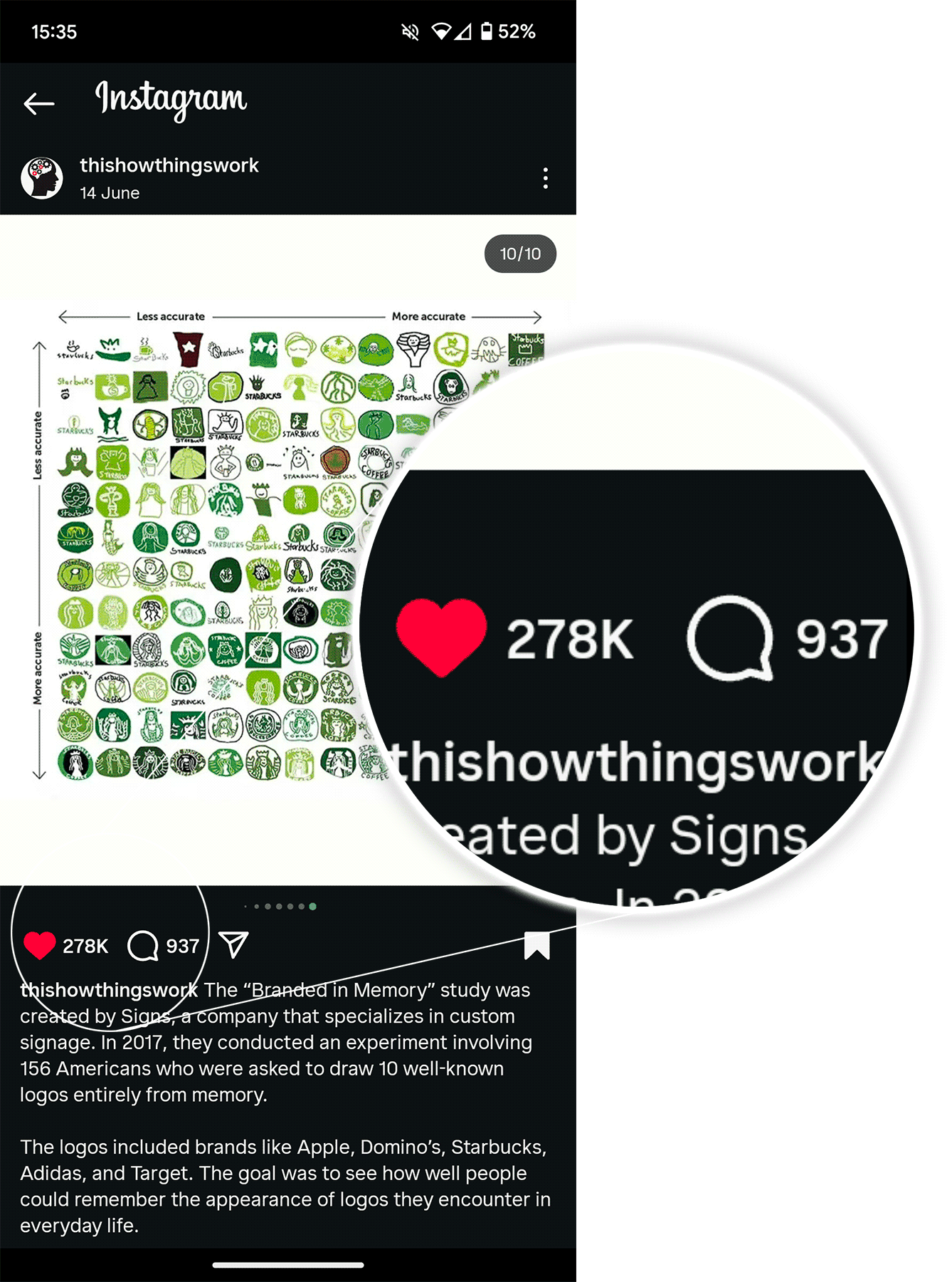
Branded in Memory was an experiment in brand recall. I recruited 150 Americans, briefed them on how to use digital drawing software, then set them the task of recreating 10 famous logos from memory.
Based on more than 1,500 drawings created over a period of 80 hours, the results revealed that, far from being stamped perfectly in our collective memory, these ubiquitous emblems largely exist as fuzzy visions in our mind’s eye.
The hardest part of this project was devising a surveying methodology that enabled people of all technical abilities to create and submit their drawings remotely. The most fun part was transposing some of the funnier efforts into real-looking scenes, as if the brands had switched their polished logos for the derpy, half-remembered versions created by the participants.
Original findings included:
- 16 percent of people drew near perfect logos, and 37 percent were good but not perfect.
- Men and women performed equally well (or poorly), regardless of the logo in question, and their level of brand engagement made no difference to their ability to accurately recall the logos.
- On average, younger people drew more accurate logos than older people.
- The most accurately drawn logo from memory by 156 Americans belongs to a Swedish company: IKEA.
Unmasked: Analyzing 10 Million Leaked Passwords

When Mark Burnett released a data set of 10 million passwords, I couldn’t pass up the opportunity to analyse it. By combining it with another dump of five million passwords which included email addresses, I could use the data as a window into how and why people choose their passwords, including:
- The most common passwords
- The most frequently occurring nouns, verbs, colours, animals, fruits, etc.
- Passwords’ typical entropy (difficulty to brute force)
- The most common keyboard patterns (a lazy way to remember passwords)
And, by running the leaked email addresses through a person lookup API, I could see which passwords were used by a range of notable people, including CEOs, Hollywood actors and talent management, journalists, technology professionals working for IBM and GitHub, and even a Division Chief for the U.S. Department of State.
Original findings included:
- Women were twice as likely as men to include the word ‘love’ in their passwords.
- The most used colours were red, blue, black, then green.
- Dogs were more popular than cats.
- The discovery of a previously unknown keyboard pattern: Adgjmptw. Generated by pressing 2 through 9 on a smartphone’s dialpad.
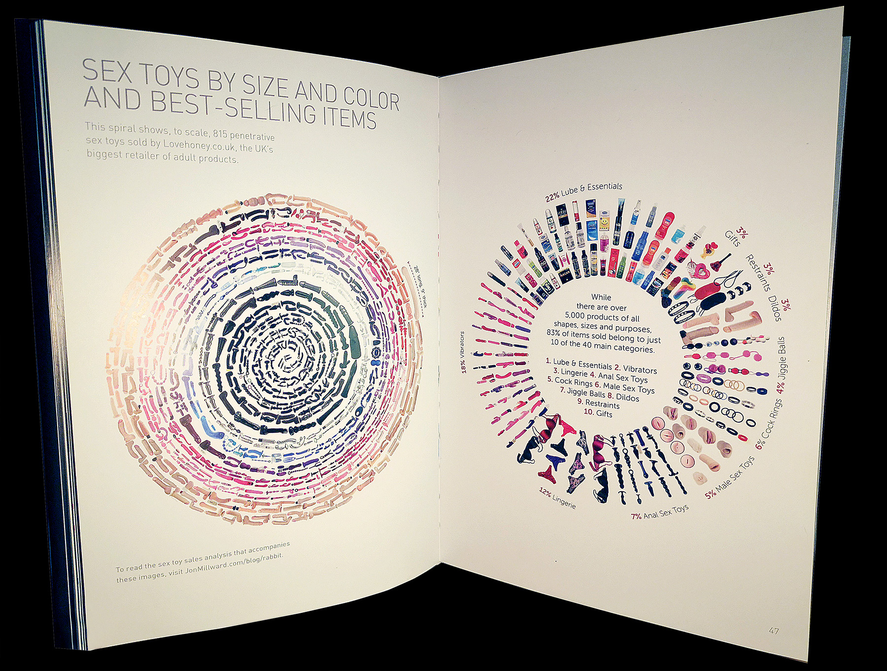
Lovehoney is the biggest sex toy retailer in the UK. When one of its founders asked me what juicy findings I could uncover in their data, I said I didn’t know – but that I’d love to find out.
For the first time, Lovehoney shared its anonymised sales and analytics data with an outsider. One million sales by more than 300,000 people.
The result of my analysis was Down the Rabbit Hole, which I believe still stands as the largest journalistic analysis of sex toy sales ever conducted. To date, it’s been read by more than 100,000 people on this site and data visualisations from the project are featured in a gorgeous coffee table book: Objects of Desire.
Original findings included:
- Single straight men buy butt plugs at a higher rate than straight men in relationships and every female demographic group.
- Single straight guys are almost five times more likely than single straight women to buy a large butt plug and 76% more likely than attached straight men.
- Women buy anal sex toys at the same rate regardless of their relationship status. But single men buy them more often than attached men.
- When writing sex toy reviews, men use twice as many explicit words as women. Women use 40% more exclamation marks than men and the word love 64% more.
- The most returned type of male sex toy is realistic lifelike sex dolls (9.2%), followed by inflatable blow-up dolls (5%).
Jagged Little Pill: Examining the Contents of 27,000 Ecstasy Pills

Depending on the exact contents of an ecstasy pill, the user can have a great night or a deadly one. In January 2015, shortly before I wrote this piece, four people in the UK died after taking red pills bearing the Superman “S” logo, believing they contained MDMA (the “hug drug”), when in fact they contained PMMA (“Dr Death”). Other pills, also branded with the Superman logo and available at the same time as those containing PMMA, did, in fact, contain the comparatively much safer MDMA.
To find out what ecstasy and molly really contained, I analyzed 27,000 test reports from five different countries, made over a 10-year period. I collected the data from EcstasyData.org –an “independent laboratory pill testing program” launched in 2001 – and PillReports.net.
Original findings included:
- One in 23 pills contained no active ingredients at all.
- Only 27% of samples with “molly” in their name contained pure MDMA.
- MSM, an industrial solvent and dietary supplement, was found in 4.9% of “molly” samples. MSM is used to mimic pure MDMA crystals.
- 58% of pill reviewers took their first pill between 9pm and midnight. Just over one-quarter took it at or before 8pm.
- Pills from the Netherlands were consistently given fewer warnings based on test results than those from the US, UK, Australia and Canada.
'Busted' and 'Seized' - Analyzing America's Most Recent Drug Hauls

Over the years, I’ve analysed and mapped drug seizures and arrests across America for many projects and clients.
In two analyses, Busted & Seized, I mapped tens of thousands of drug interdictions across all 50 states as reported by local and national media outlets.

The findings were featured on a data-driven educational show on National Geographic called The Big Picture.
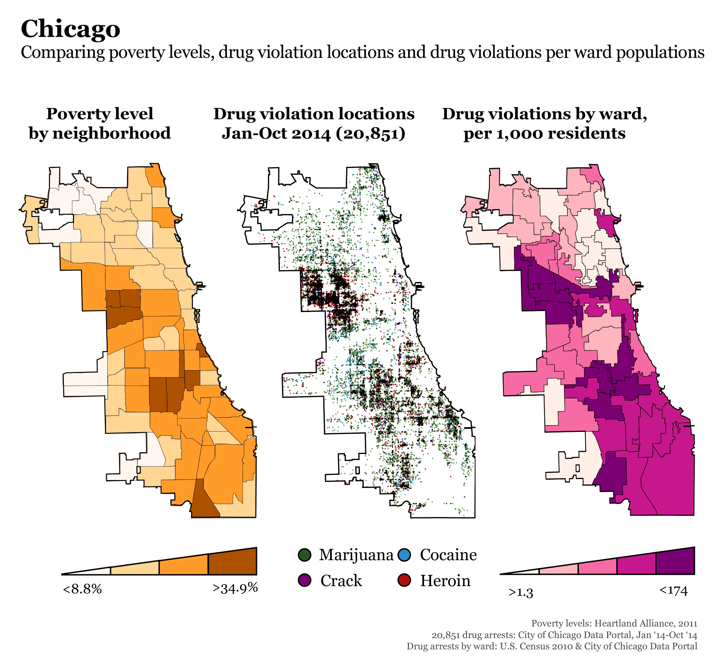
In another drug-focused project, Drug Arrests Across America, I zoomed in on eight major U.S. cities and the drug violations that occurred within their borders over several years.
Here’s Chicago and a clear correlation between its drug arrests and poverty levels.
Drugs on Campus: Ranking Colleges by Their Per Capita Drug and Alcohol Arrests

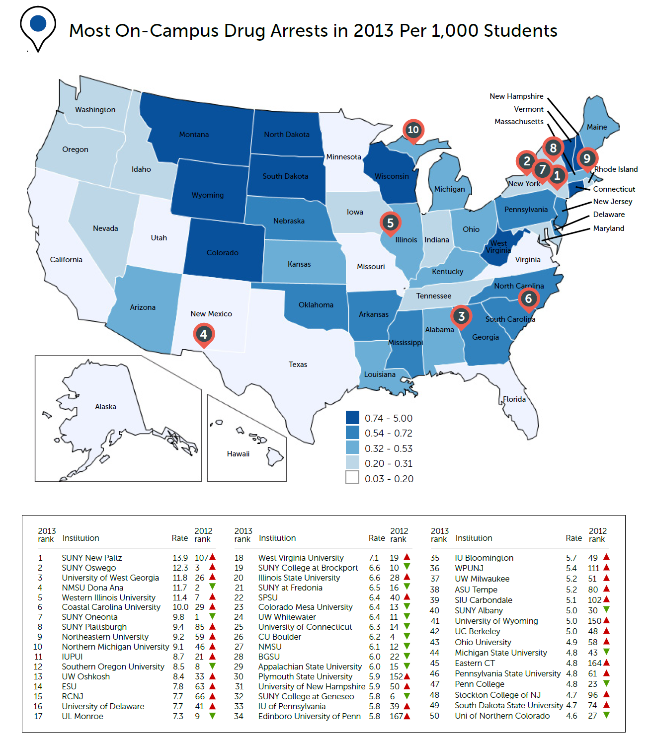
For several years, I produced Drugs on Campus – an annual report that ranked thousands of U.S. college campuses by their per capita drug and alcohol arrests.
A high number of arrests could be interpreted as a sign that campus police were doing a good job. But it could also be seen as a reflection of overly strict security. In one year, these contrasting interpretations of my findings became particularly visible.
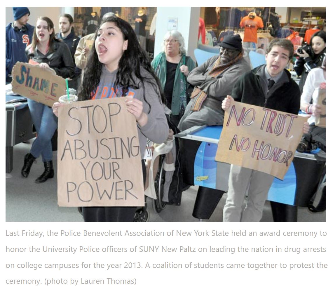
While police officers from SUNY New Paltz (the college that ranked highest for on-campus drug arrests that year) were being given a brass plaque and words of praise by the Police Benevolent Association for nabbing more students than any other university, student activists and their supporters in the wider community gathered outside with banners to chant “Shame! Shame!”. They believed the campus didn’t have a drug problem; it had an “over-policing” problem.
Come Here Often? The World's First 'Semen Census' Reveals Ejaculation Preferences of Men and Women

I conducted the world’s first “semen census” by asking 740 heterosexual American men and women where they or their partner most recently ejaculated, where they most and least enjoy coming, where they believe the opposite sex loves and hates it, and where they most recently saw a man ejaculate in porn.
For several years, I’d pondered the idea of using click-tracking to gather precise data on ejaculation experiences (survey takers gave their answers by precisely clicking on a photo of a naked woman). It’s a pretty insane idea, but one I jumped at the chance to make a reality. And the results didn’t disappoint.
Original findings included:
- 64% of men and 42% of women said their preferences have been influenced by porn.
- 4 in 10 have never given or received a facial come shot, while 1 in 4 do it “sometimes or often.”
- Men prefer giving facials 3.3 times more than women enjoy receiving them.
- The more people watch porn, the more they choose facials as their favorite finishing style.
- 26% said facial come shots are degrading – feminists were less likely than non-feminists to think so.
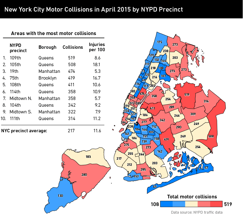
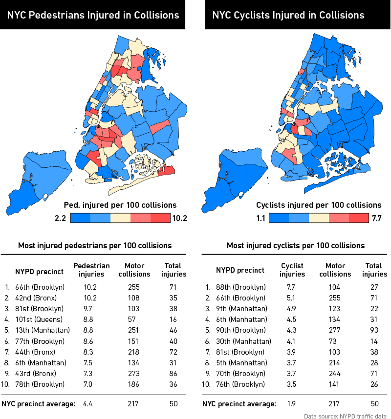
Mapping Traffic Accidents in NYC

When the New York Police Department began releasing data on traffic accidents in clean, readable data sets instead of cumbersome, error-ridden PDFs, I spotted an opportunity for an interesting analysis.
I analysed and mapped one year of traffic accidents across the five boroughs to reveal hotspots and trends.

Original findings included:
- Queens had more traffic accidents than any other borough.
- 11.6% of accidents resulted in injuries.
- The main cause of accidents was driver inattention/distraction, followed by failure to yield right-of-way.
- 77% of accidents involving bicycles resulted in at least one injury.


